
Monday, 27 February 2012
BAG RESEARCH
TAG RESEARCH
To begin our 'Coastal' project i have been asked to research Tag, Bookmark and carrier bag design. This is because in Computer art/Graphic design we are working towards our own tags, bookmarks and maybe bags. We will create the designs mainly on the computer however i would also like to make a 3D tag.

 During my research of tags i came across these two cute tags/labels. i like them as they are quite simple yet very sweet and elegant. i like the 3D effect with the little flap i think that works really effectively on a tag. I also really like the ribbon and stud, i find this label quite inspiring and might use the ideas of the ribbon and the flap in my own tag.

 During my research of tags i came across these two cute tags/labels. i like them as they are quite simple yet very sweet and elegant. i like the 3D effect with the little flap i think that works really effectively on a tag. I also really like the ribbon and stud, i find this label quite inspiring and might use the ideas of the ribbon and the flap in my own tag.
During further research i came across these two labels which i think were perfect as they are 'coastal' themed and 3D just like what i want to create. i love how the shells have bin stuck on and it seems like the use of maps in the background which i think is a really good idea i am going to take in to account as well. I really like these labels as they are coastal themed which i think was very lucky for me to find. I like them because they have a grey vintage effect and actually remind me of the sea side. I find these labels very inspiring.
Thursday, 23 February 2012
COASTAL - BETH FLETCHER
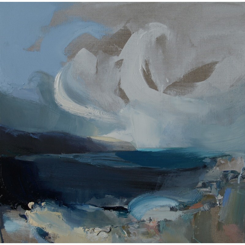
From extra research i went on to website to try and found some background infromation and wondered if her pictures were dull and dark for a certain reason or if that was just the style she liked "These layered, transient, seen and felt moments, when transformed through the painting process, are intended to engender a prolonged engagement with the painting as a mediated experience of landscape. In the studio, rather than directly in front of the landscape, I can paint under the influence of the memory’s interpretation of the living landscape – the ‘soul-yearning’ which is a response to more than what is manifest only to the eye."
Monday, 20 February 2012


I think it looks quite effective and i do like the kind of abstract and unique effect of it. i tried doing further research of artists that have done something like this i couldnt find anyone easily. Although i liked my idea i dont think it looks very professional and think it could of done with some further editing.
Monday, 6 February 2012
I LOVE LEOPARD PRINT

 I used the burn tool to go around my eyes and darken around them as they had became a bit faded, i think this worked really well and was very easy to use.
Then for my lips i used the lasso tool to go around my lips then filled them with a colour
INSPIRED WORK - I LOVE LEOPARD PRINT

This piece of work was firstly done because I was inspired by the Andy Warhol self portrait 1986, I then decided to create my own image inspired by it. I thought of something i could layer over my face and then thought of how i love leopard print and thought it would be a great print to use seen as the theme of the work is self and identity. I also thought it would look really effective and work well. I found a good image of myself which was in black and white so therefore then made the leopard print black and white. I lowed the opacity of the leopard print image and copied and pasted it over my face and was playing around with different things to see what looked best i kept it as normal but lowered the opacity to around 52% so that you can still see the features of my face. I also cut around my face and added a black background, i dont think it looks very proffessional because of the sharp lines around my face and also some of my features look a bit weak.
Subscribe to:
Comments (Atom)